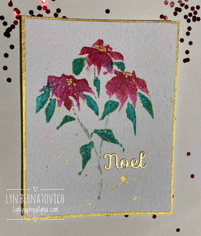
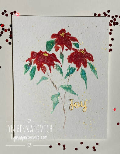
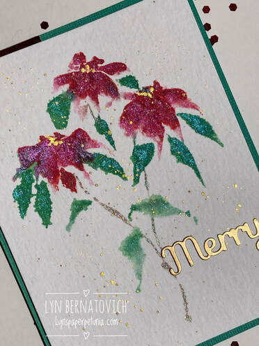
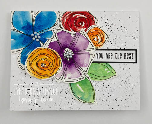
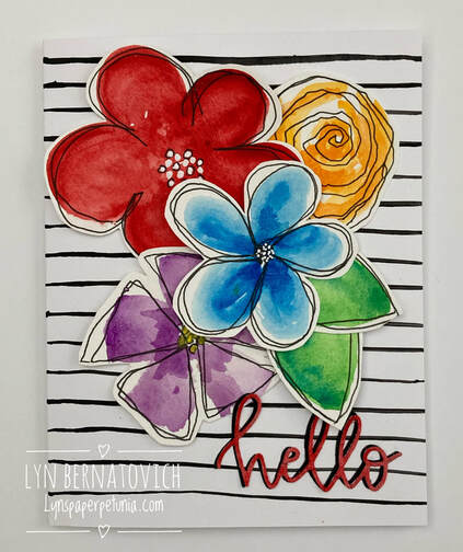
December is my favorite month of the year for card making (although, come to think of it, every month is my favorite for cardmaking)! However, in December, I love to design Christmas cards for mailing and, I also gift a variety of assorted cards made throughout the year in little bundles to family and friends.
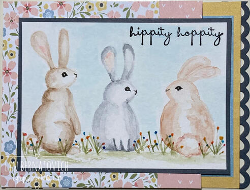
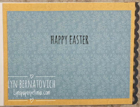
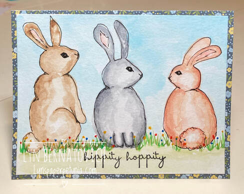
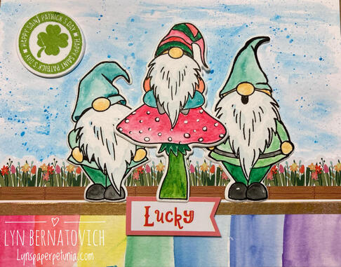
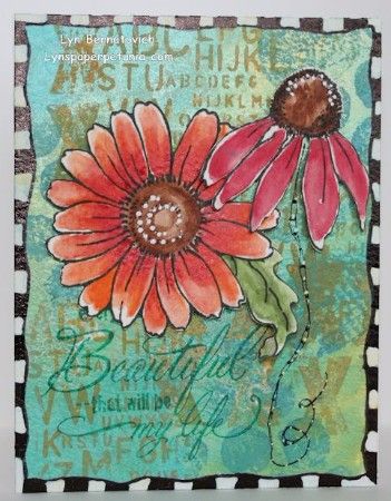
Here are two of my cards out of eight that I designed this year!
Here are two of my cards out of eight that I designed this year!
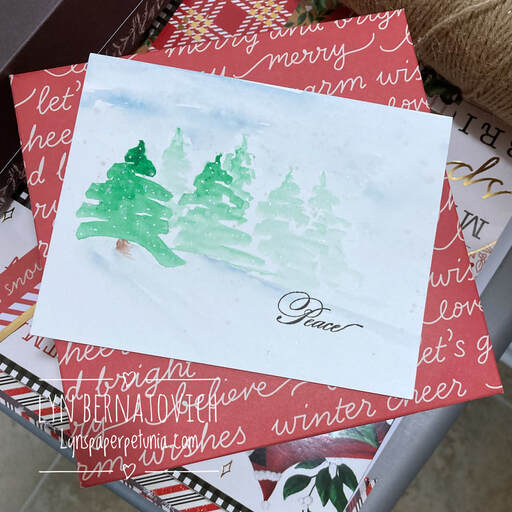
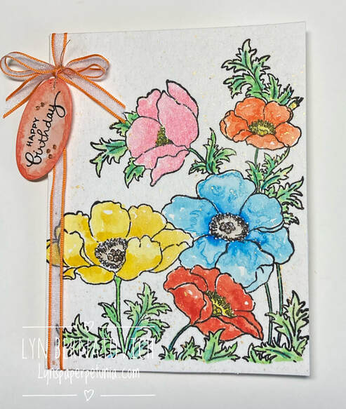
The above card is a very simple design on Canson watercolor paper that began with the tree on the left. By adding more water to my brush, I was able to create trees that appear to be in the background.
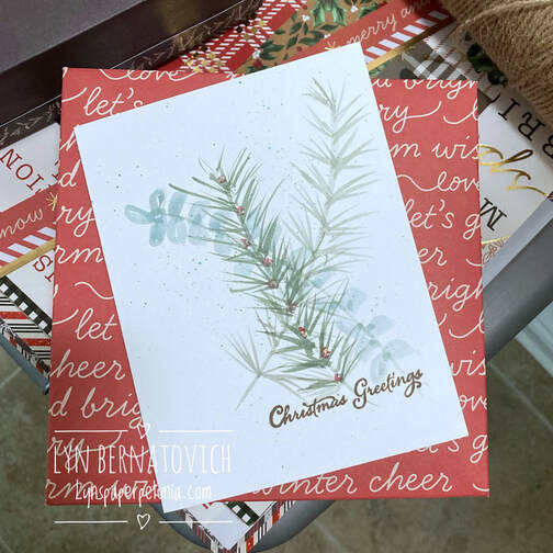
I experimented with the above card design on regular cardstock and I'm rather pleased with the result! I worked fairly quickly being mindful of controlling the water so as not to warp the paper.
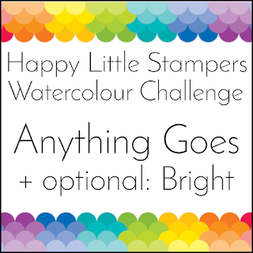
As we close out 2023, I'd like to give a special thanks to Kylie for leading and administering all the monthly blogs over the years! I have thoroughly enjoyed being on the design team for Happy Little Stampers Watercolor Challenge.
I hope your holidays are filled with family, friends and love.
XOXO
LYN


 RSS Feed