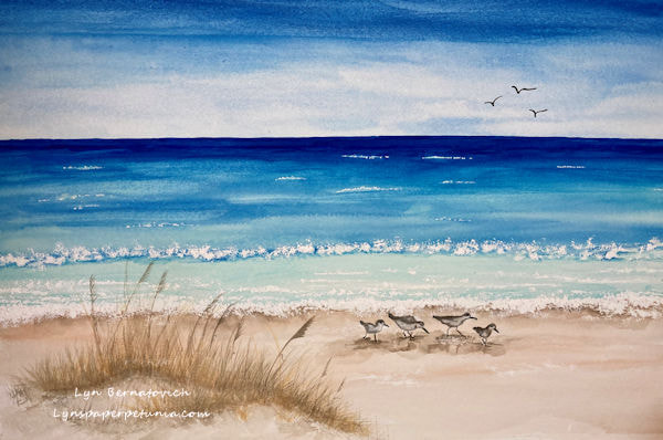
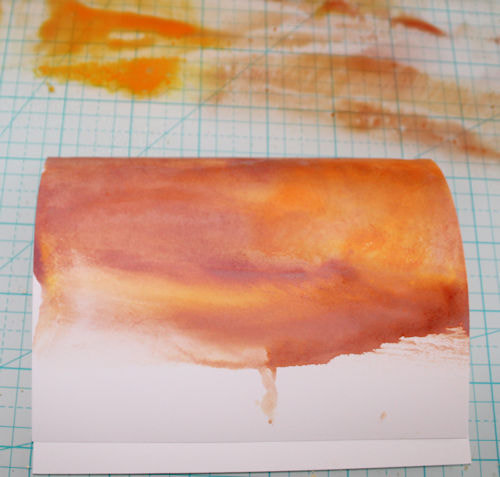
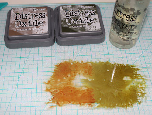
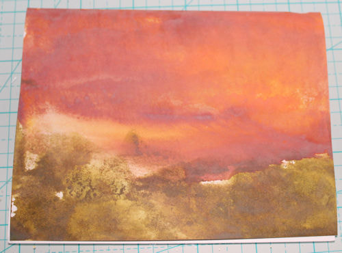
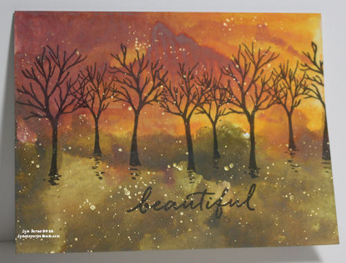
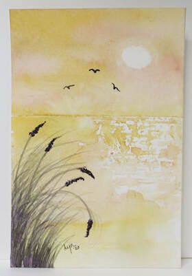
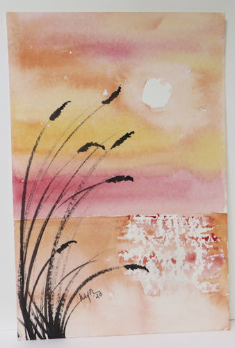
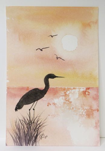
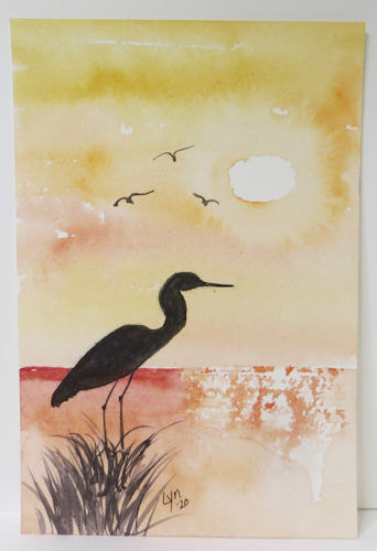
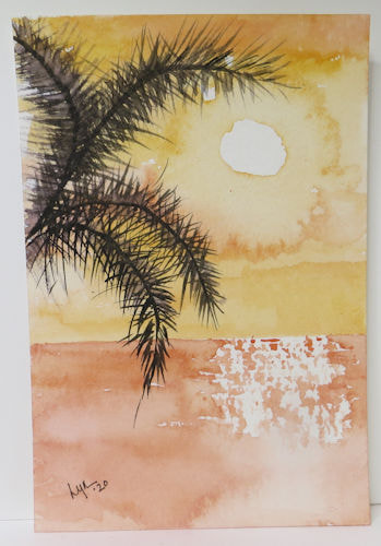
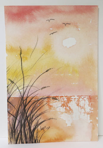
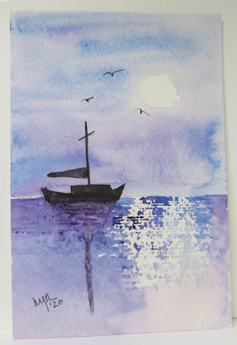
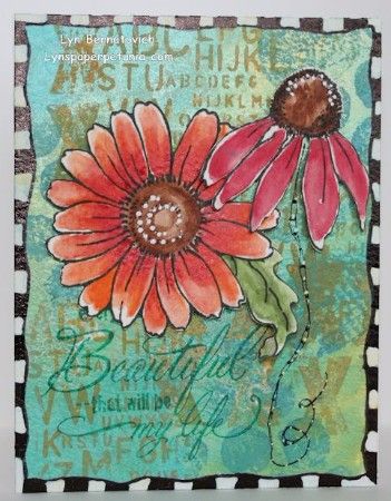
Today was about the pure enjoyment of simple pleasures. A walk along the river always enriches me. Taking photos of whatever caught my eye along the way was amazing. Not only did I get in a little exercise, I gathered several reference photos for my sketching practice, and I decided to post on my blog about it.
I miss writing and sharing my creative journey that the E-News gave me. However, I also love my blog and I can share just as well from here!
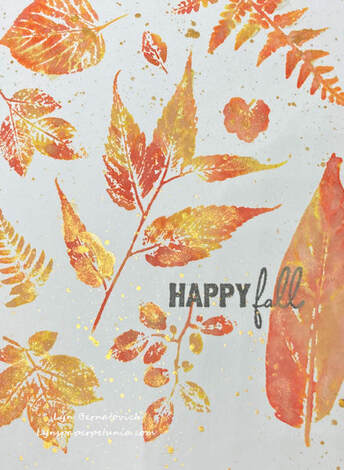
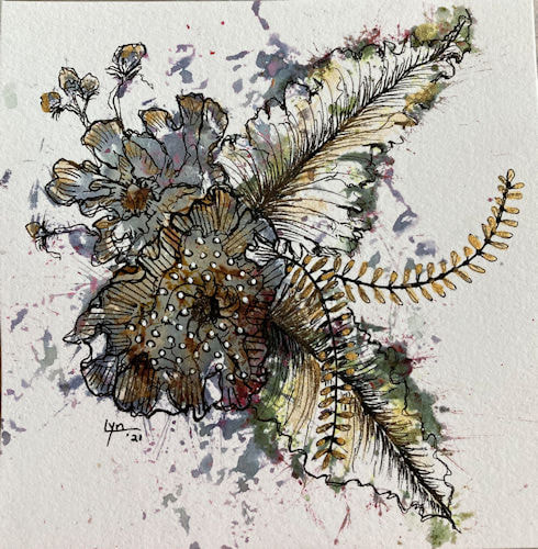
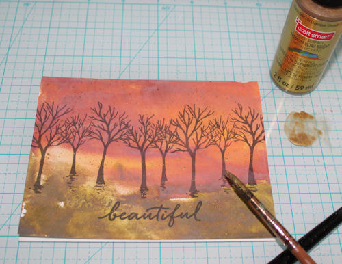
Until next time, I have some dried up leaves to sketch!
XOXO
LYN
Until next time, I have some dried up leaves to sketch!
XOXO
LYN


 RSS Feed