The Stamp Nation has a series called Masterclasses and this week begins a segment on Spectrum Aqua markers! I was fortunate to be provided a few sets of markers from the good folks at Spectrum Noir along with a couple of their amazing stamp sets. I designed a card as part of our design team work with these amazing products that you can see simply by logging or joining The Stamp Nation!
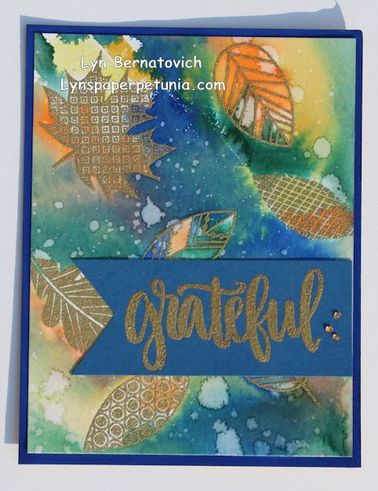
Today, I am posting a card for the love of working with Spectrum Aqua markers and I can't resist a challenge!!!! My card is all about emboss resist, so you know that means it starts with heat embossing images and then creating a watercolor a background.
Here's my card:
Today, I am posting a card for the love of working with Spectrum Aqua markers and I can't resist a challenge!!!! My card is all about emboss resist, so you know that means it starts with heat embossing images and then creating a watercolor a background.
Here's my card:
To create the resist images, I began by placing various Leaf Motif stamps (Catherine Pooler Designs) on a Tonic Studios Tim Holtz Stamp Platform, inking with VersaMark ink (Tsukineko), sprinkling Stampendous Detail Gold embossing powder and heat set. The sentiment grateful (SOA Autumn Blessings Catherine Pooler) was heat embossed in the same manner on Fun Stampers Journey cardstock with 3 added gems (A Muse Studio).
For the background, I literally scribbled Spectrum Aqua markers (Nature) one color at a time (light to dark) in random areas around the cardstock panel and then quickly spritzed with water to help the color soften and blend. Before each color change, I heat set. There's probably a total of 5-6 colors on this panel. Once it was dry, I spritzed the entire panel with the Tim Holtz's Distress Sprayer to create splotches. I heat set after a few spritzes and then spritzed again.
For the base panel, I colored directly around the perimeter of a premium white cardstock (Catherine Pooler) with a Spectrum Aqua marker to match the blue in the blended background.
I rather like the uneven movement of color in the background. Even though the result isn't necessarily screaming autumn, the vibe of autumn is clearly there nevertheless.
Thanks for stopping by!
xoxo
LYN








 RSS Feed